Towers Growth
Towers Growth helps companies who move, make, and maintain the physical world grow through measured marketing.
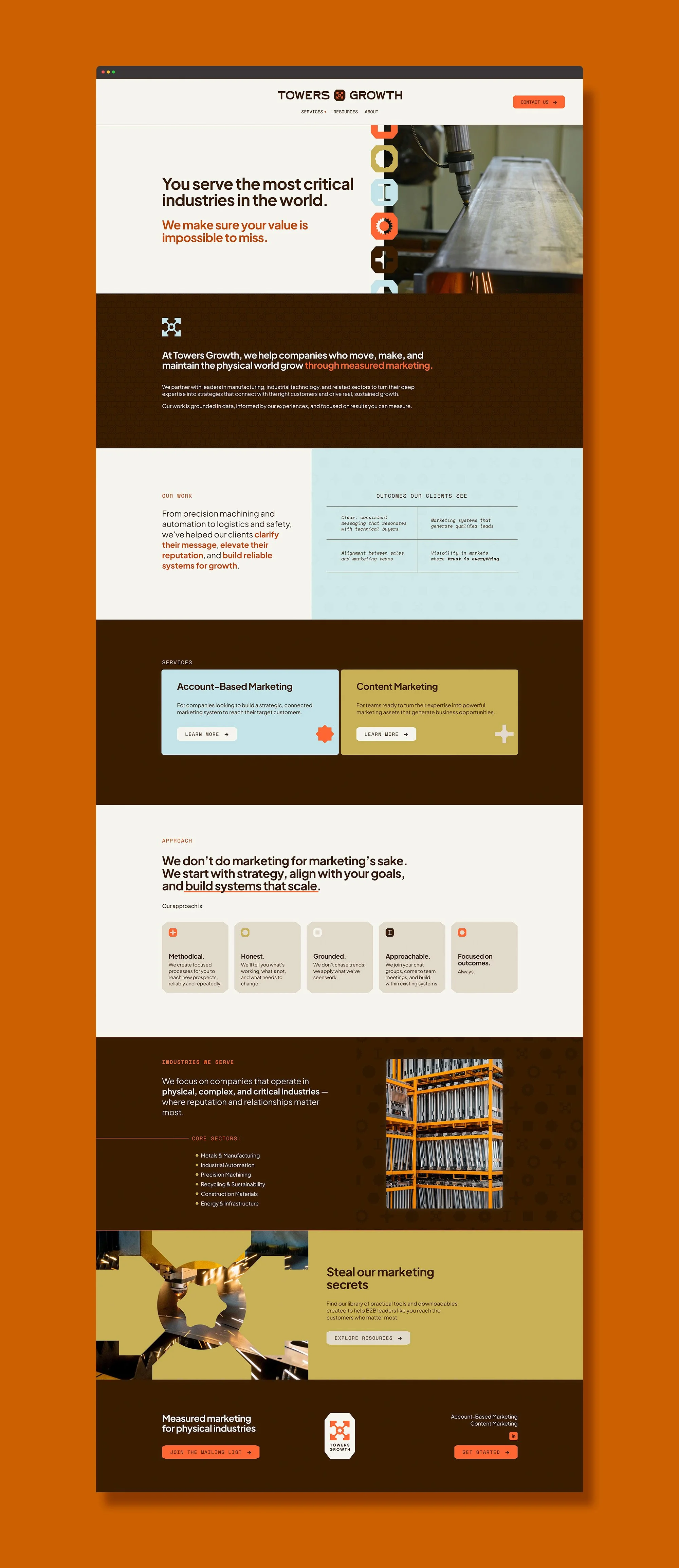
Led by founder Mackenzie, Towers Growth serves some of the most powerful B2B industries in the world. She came to us with a clear vision for the brand: bold, honest, and methodical. This developed into a truly wonderful partnership as we worked together to design a brand that captured key iconography and imagery from the industries Towers Growth serves.
Services —
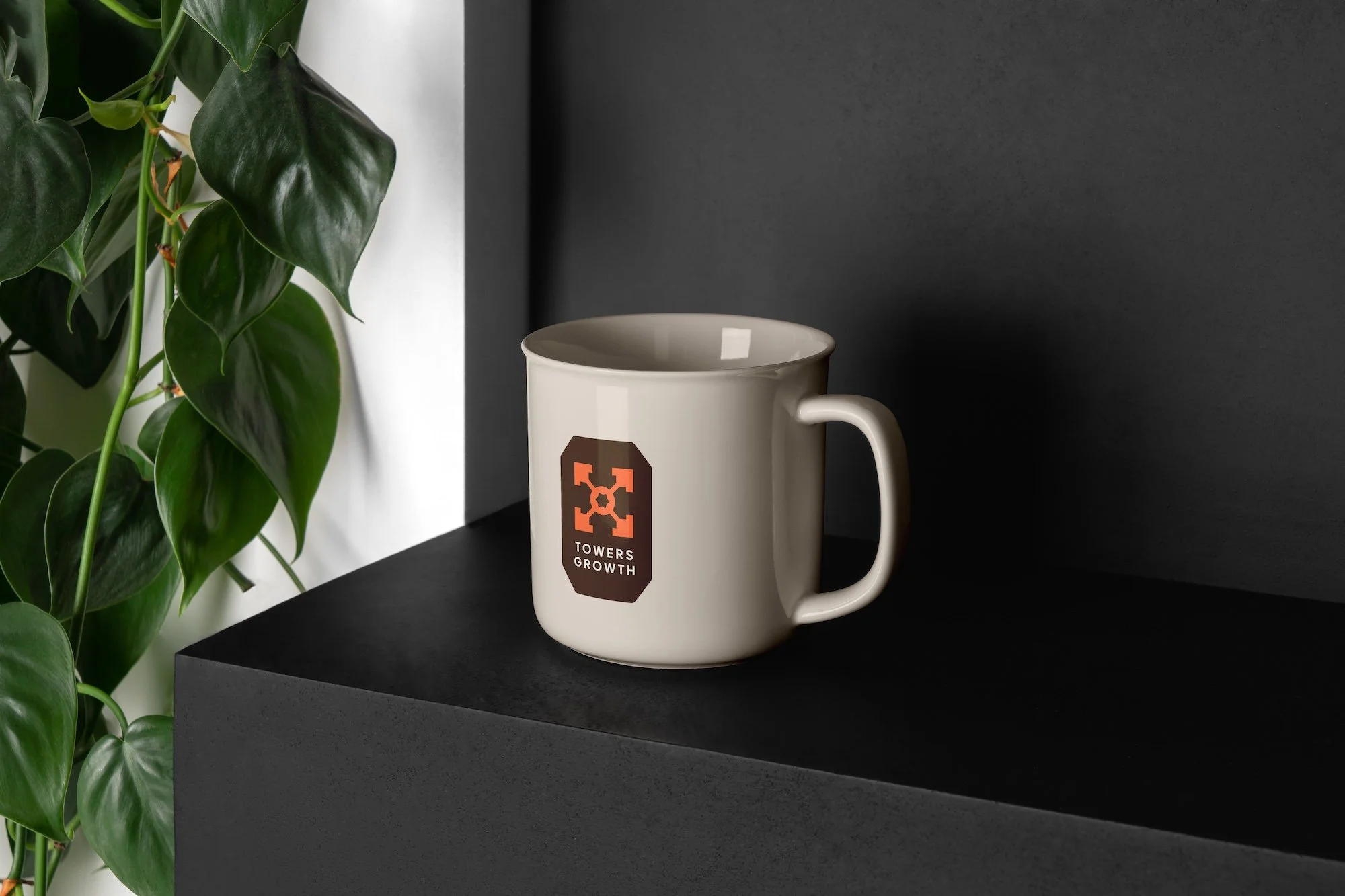
Logo design
Type and color system
Pattern design
Brand guidelines
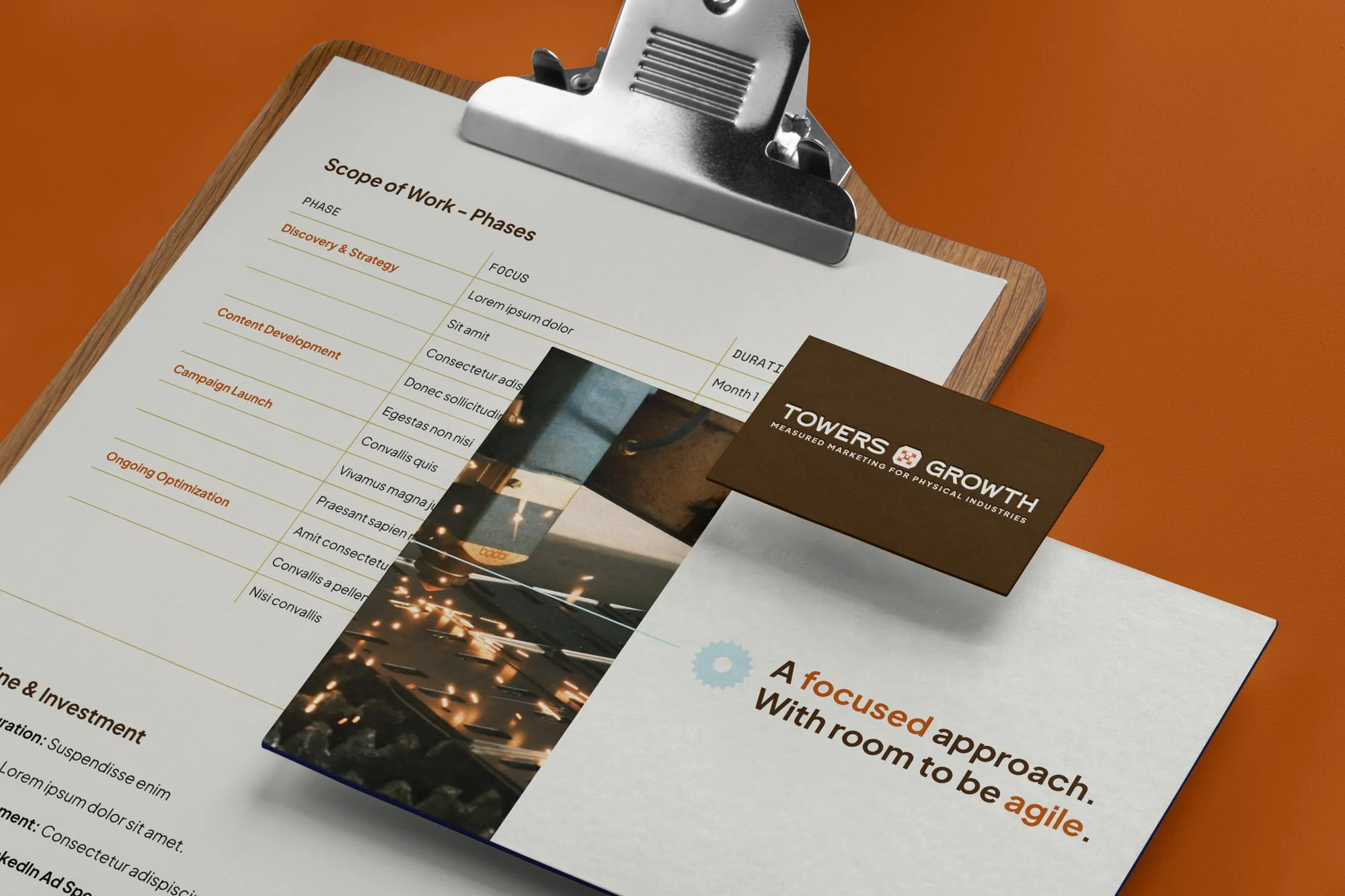
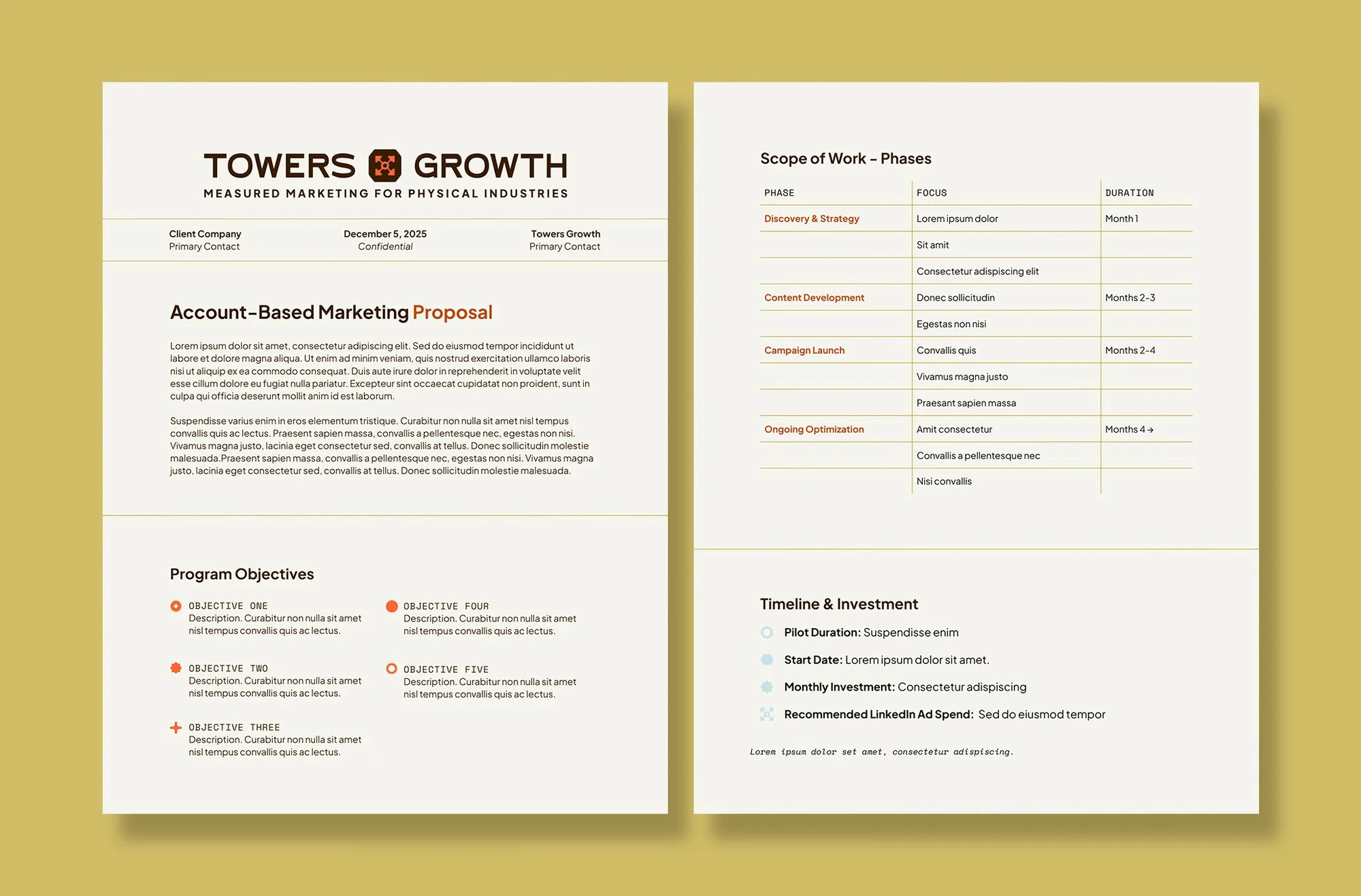
Collateral Design
Squarespace website design
View the Website
↗
View the Website ↗
Brand Design
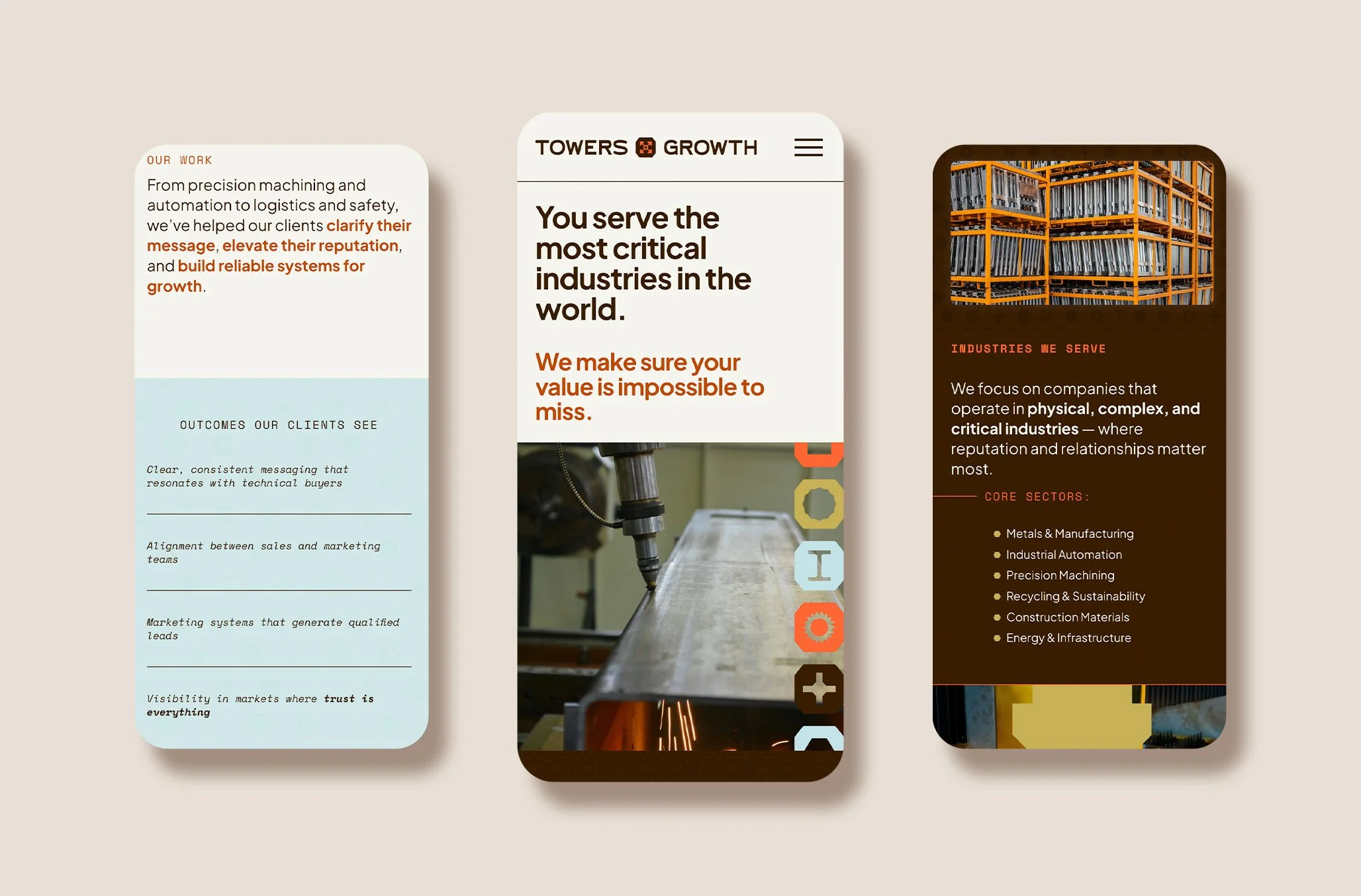
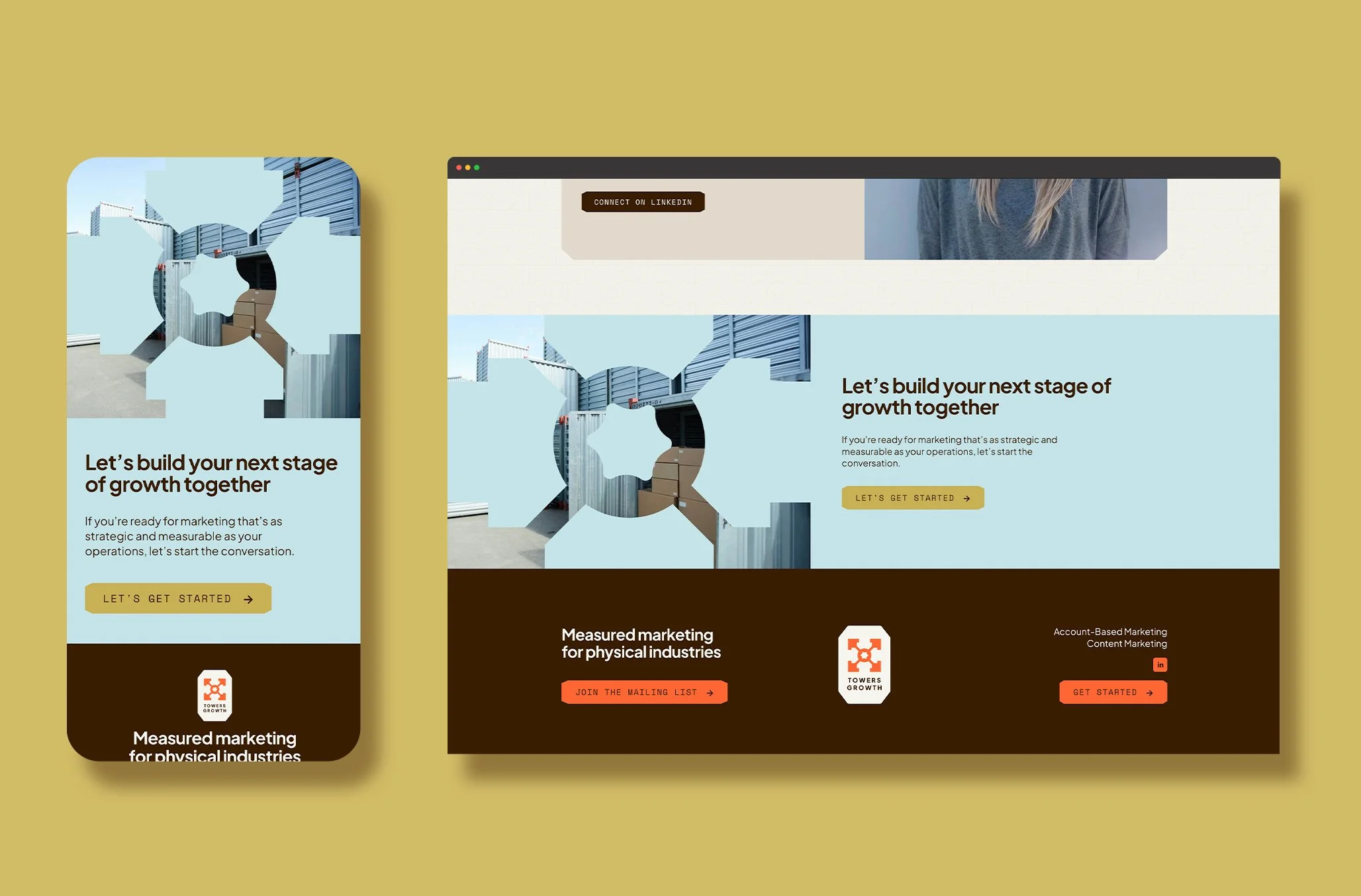
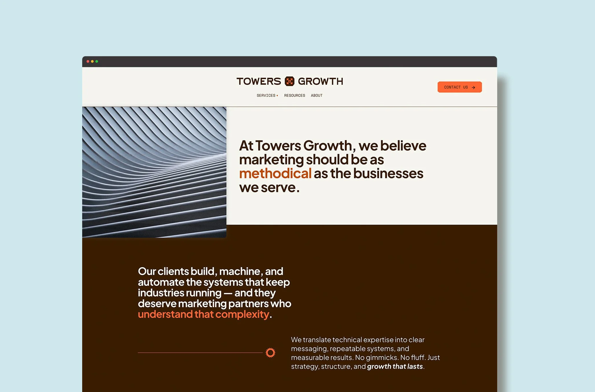
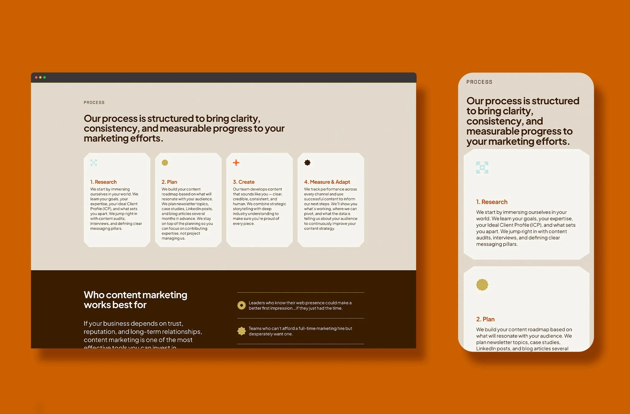
To make Towers Growth stand apart from other marketers that serve a broader audience, we created a brand that feels immediately familiar to their client base. We drew inspiration from vintage machinery logos for the bold and charming sans serif font featured in the logo. The logo features the t-slot of an aluminum rail that is both recognizable to industry insiders and abstractly symbolic of growth. The brand is further supported by geometric icons based on tools, materials, and machinery specific to the physical industries. Together, these elements result in a highly specific, attractive, and versatile brand that appeals directly to the target audience of Towers Growth.
“Working with the Happenstance team has been a dream. When I started looking for a team to take on the branding and web design for my business, I wanted to find people I could truly collaborate with. I was coming in with a lot of ideas, but wanted people who could take it over the finish line and wow did they accomplish this! I loved working through design revisions with Annie & Shelley and feel like they really ‘got’ what I was hoping for. They executed far better than I even imagined. I'm so grateful for their support and highly recommend other small business owners work with them!”
Mackenzie Yates,
Founder & Sr. Growth Strategist
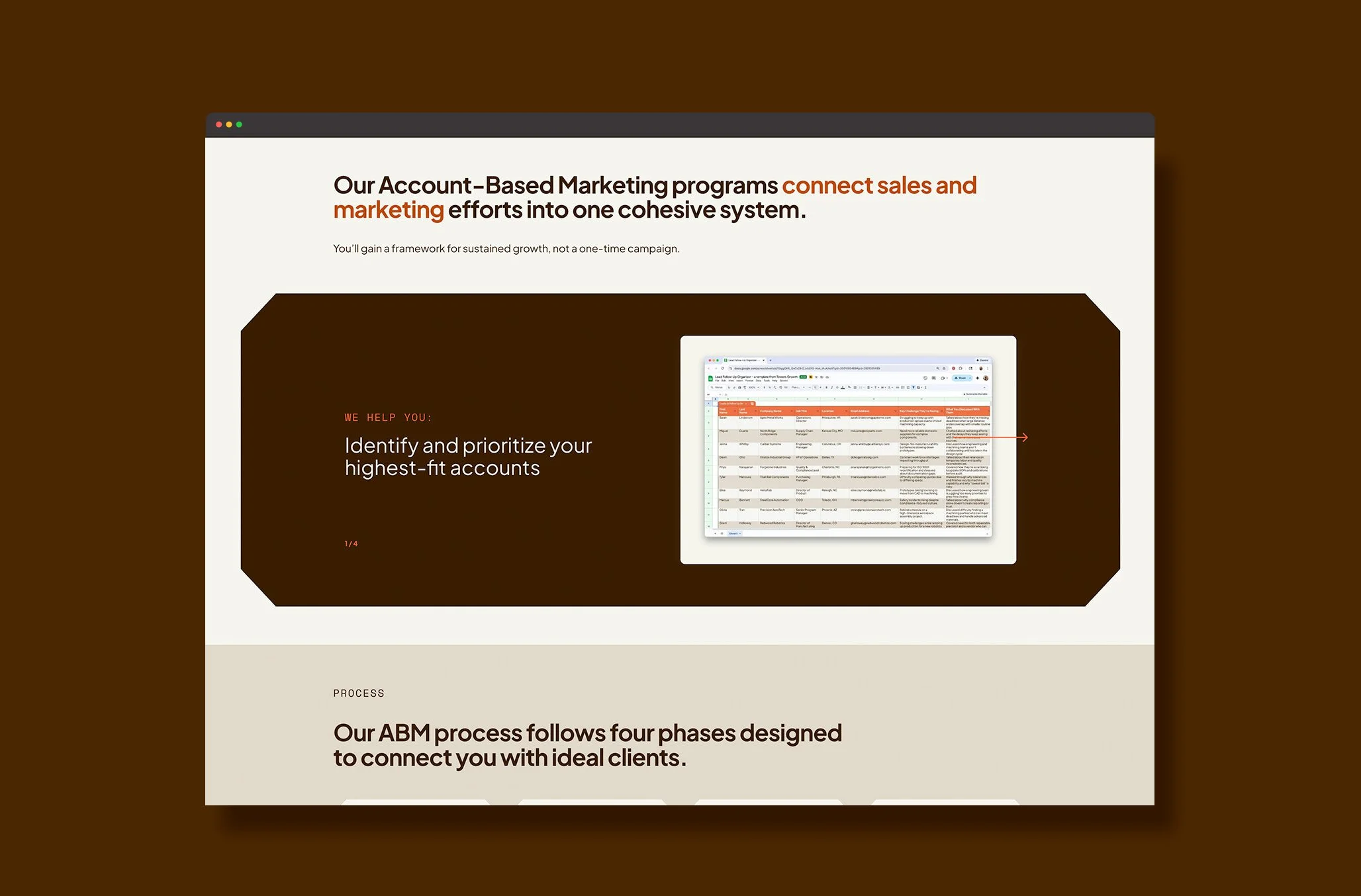
Squarespace Website Design
The website combines honest copy, industry-specific photography, and branded icons to capture the attention of powerful players within the physical industries who are ready to level up their marketing. With defined sections and ample spacing, the content is quick and easy to digest for the target market of busy founders. Animations are sprinkled throughout the site to intrigue and delight the audience.