Applying Your Brand to Canva Templates
In our last blog post, we talked about how you can add your brand elements to a Canva brand kit to make using your brand a breeze. Today, we’ll use those elements to apply your brand to Canva templates so you can keep your look consistent and clean, no matter the application!
Step One: Pick your template
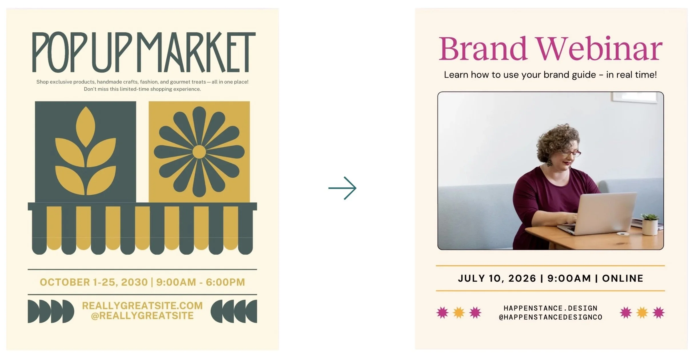
Canva has an extensive library of templates for any occasion, format, or platform. Choose a template that suits what you are making the best. For this tutorial, we’ll be using a template that looks nothing like the Happenstance brand to highlight the difference you’ll see once the brand is applied.
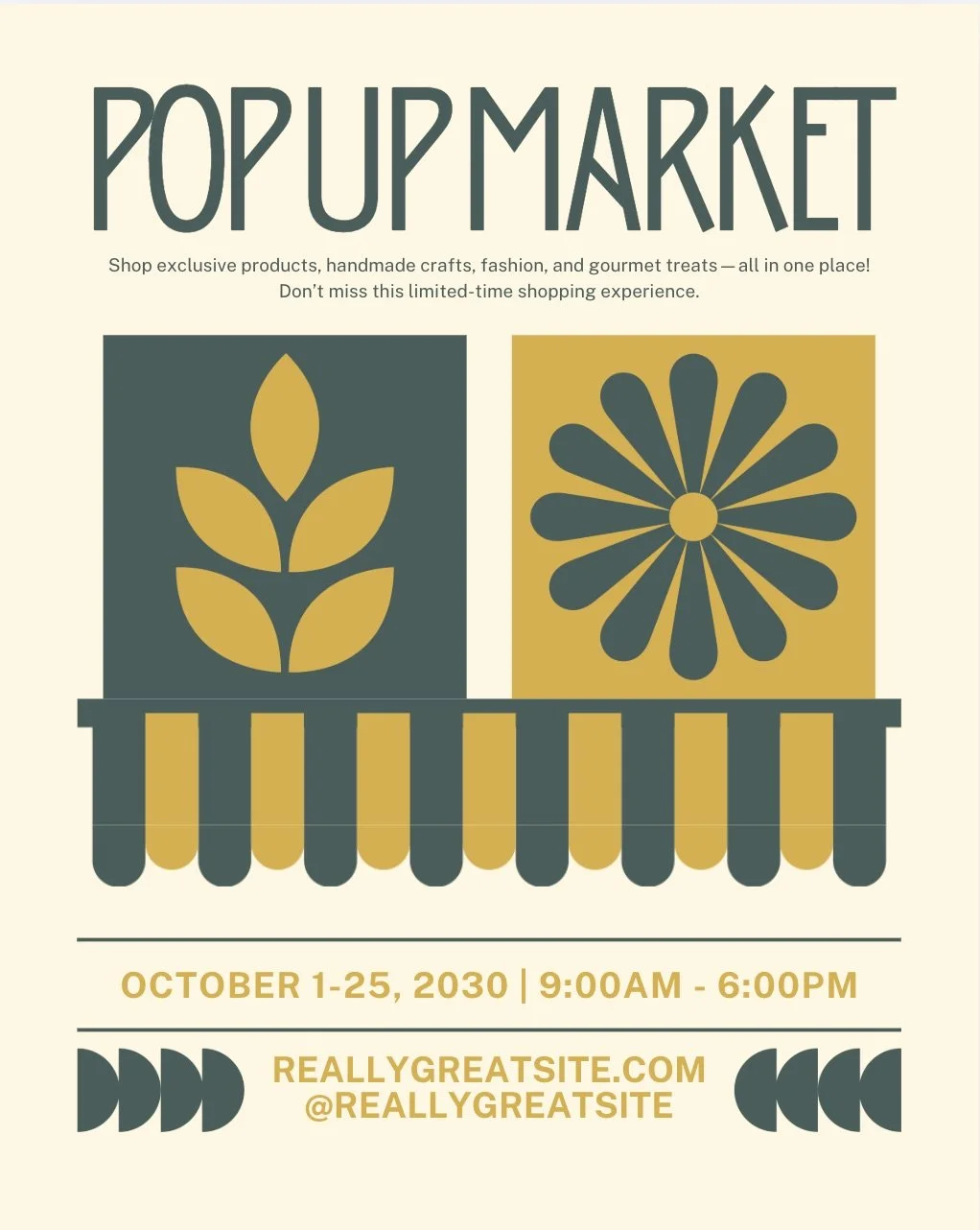
Step Two: Customize your text
We recommend customizing the text before adjusting anything else. That way, you can make color decisions and font size choices that fit your content best.
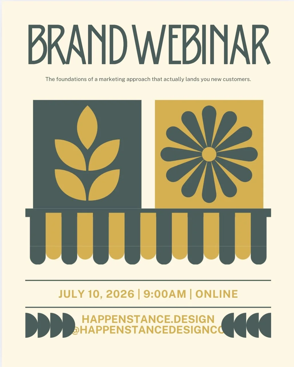
Step Three: Add your colors
Next, we’ll apply our colors. Try to use similar tones, if possible, to the template to keep contrast and legibility high. Switch light neutral background colors to other light neutral background colors; vibrant colors to vibrants; dark text to dark text, etc. Otherwise, refer to your brand guidelines for suggested color palettes and stick to one of those.
TIP: Canva has a handy “change all” button at the bottom of the color selection panel. This allows you to change all instances of a color in your design. Try it out!
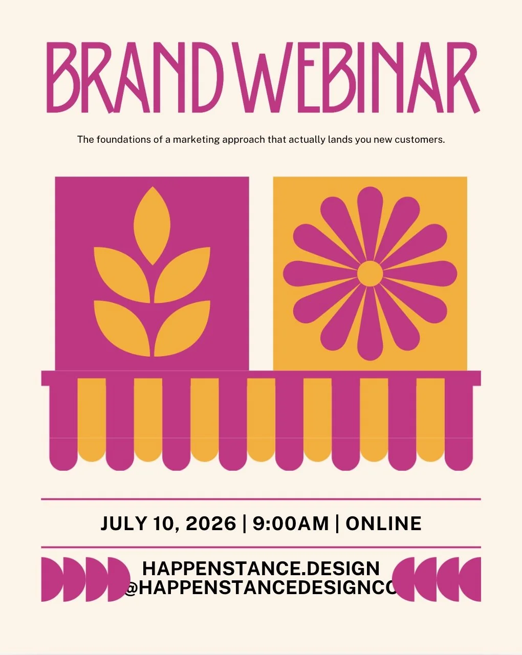
Step Four: Add your fonts
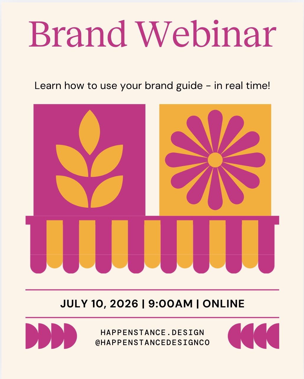
Apply your brand fonts throughout, minding your brand guidelines as to which fonts belong as headings, body text, and subheadings. In the example below, you’ll notice that adjusting the font family isn’t enough to make it look like your brand (or look good in general!). The font sizes in many spots were too large or too small to be legible. The next image shows what it looks like when we’ve applied spacing, case (uppercase vs. lowercase), and font sizing according to our brand guidelines.
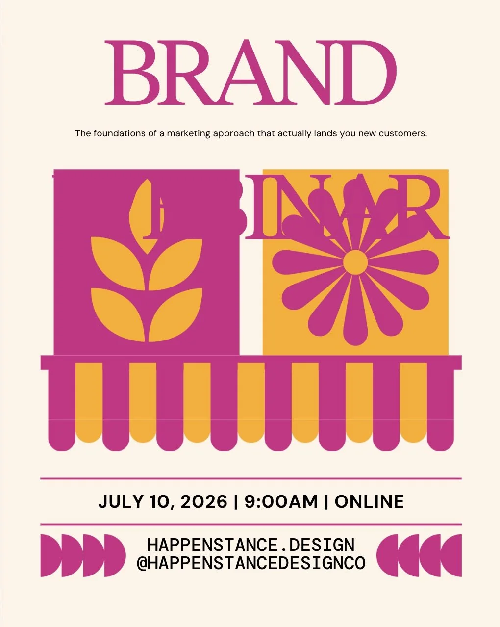
Step Five: Adjust layout
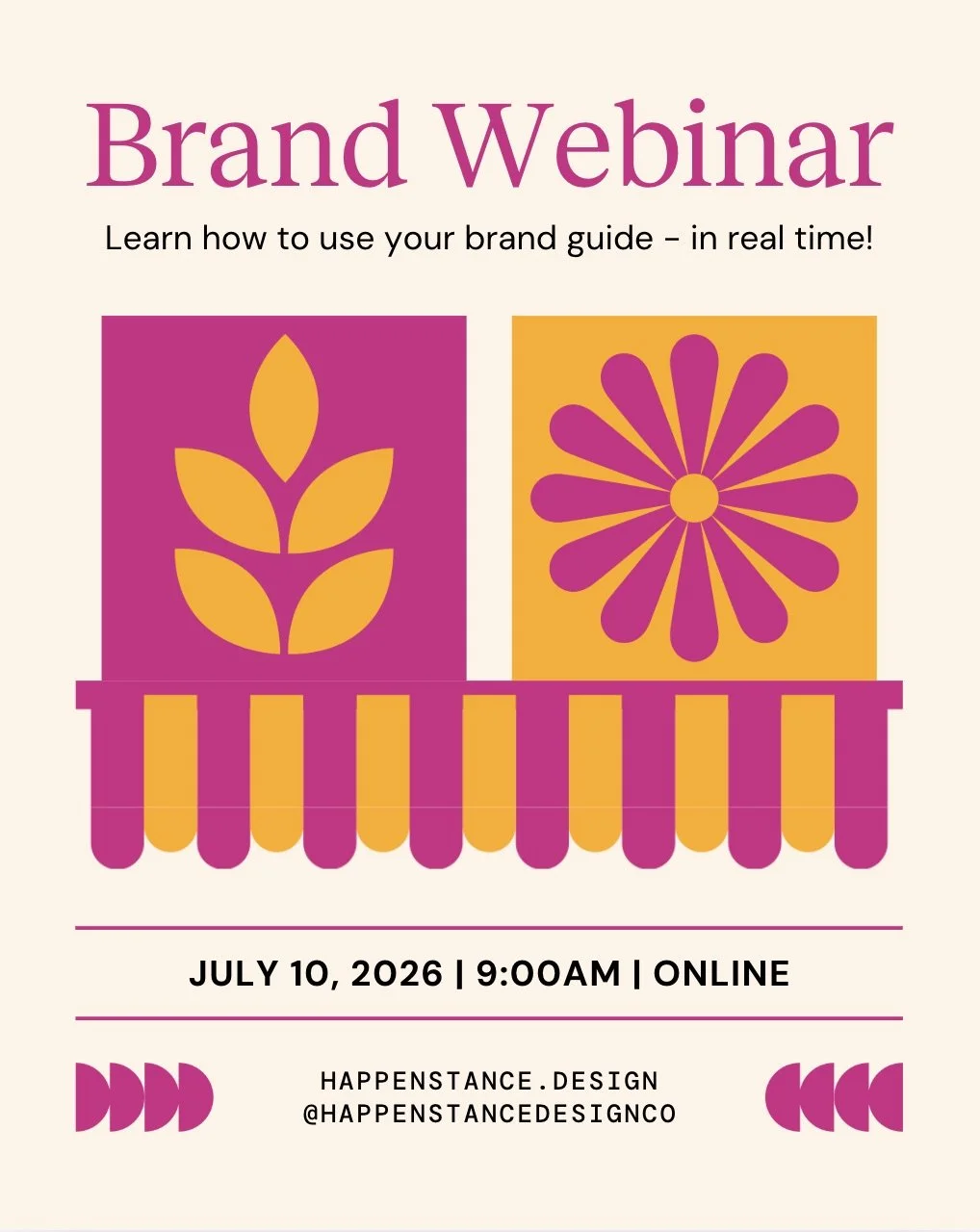
Next, you’ll want to zhuzh! The last screencap doesn’t look bad, but it certainly doesn’t look great either. We’ve adjusted the spacing of the text, as well as the size of the bottom graphics to make things look better.
Step Six: Add imagery
To really make it feel like your brand, look for opportunities to apply your imagery. Is there a place to add your logo? Could you swap a graphic included in the template for one of yours? Using the Happenstance brand, we chose to replace the semi-circles at the bottom with our starburst icon. We also replaced the main graphic with a photo, as the market-y vibe didn’t fit based on the context of a webinar. We chose a free image from Unsplash of a woman working at her computer (potentially watching our webinar) in a sweater that matches our brand magenta. We rounded the corners of the photo, as this is an image treatment we use often throughout the Happenstance brand.
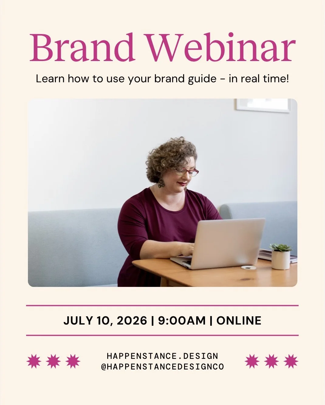
Take a look at your nearly finished image. Is there anything else it could use to really stand out? As we look at the one we’ve made, we’re missing the pretty orange from the template graphics and decided to add it back in a few spots. We decided to increase the character spacing of the date/time/location as it was looking a bit heavy. Lastly, we added a thin black border around the image to make it stand out from the background more.

Voila! This is now a graphic we can use throughout our advertising that feels fully in line with our brand.
P.s. If you’d like to see a live demo of us applying a brand to a Canva template, join our webinar on July 8, 2026 with Towers Growth. Learn more here.
The Latest from Happenstance
✸
The Latest from Happenstance ✸